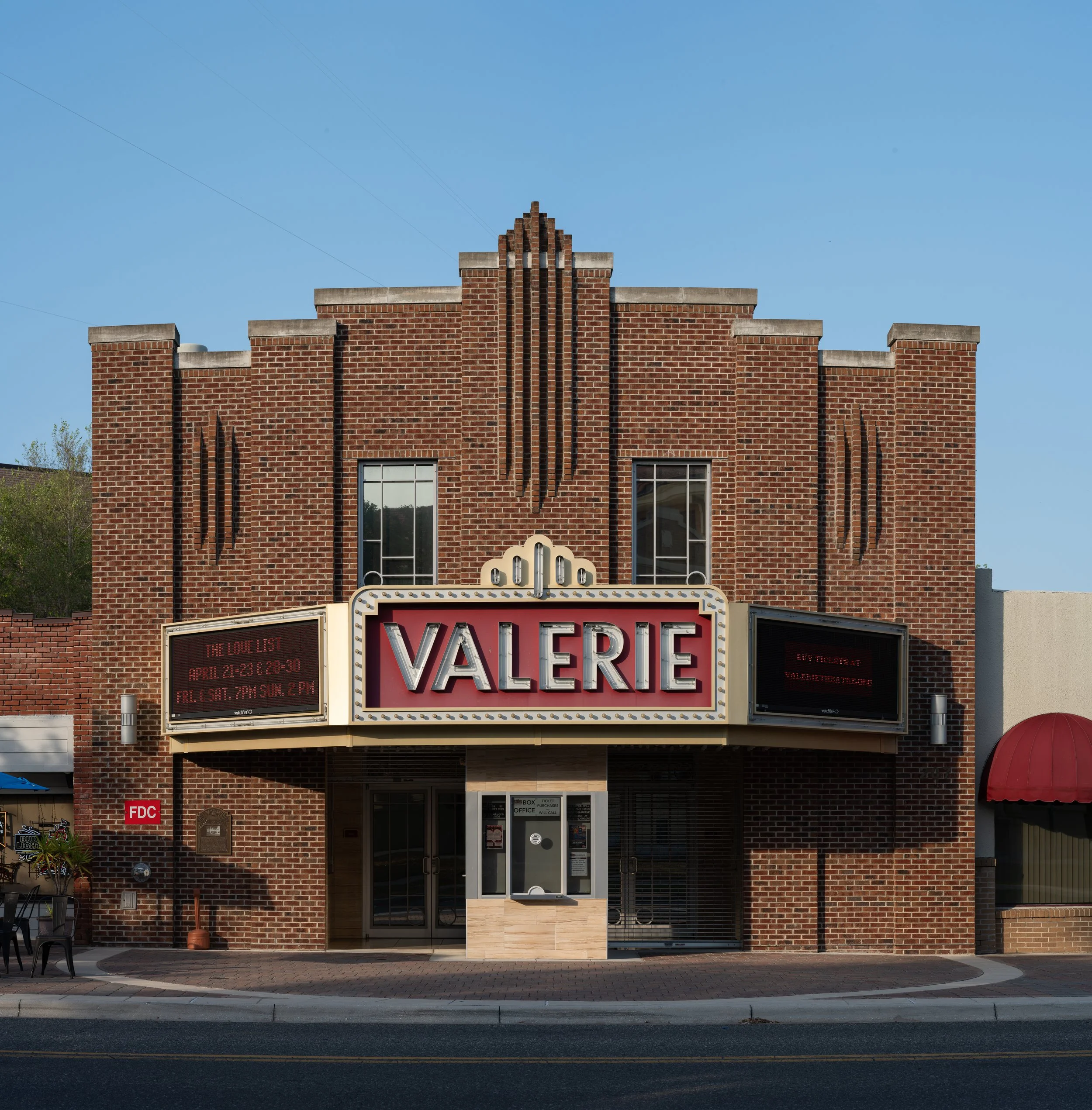
RAW multi-row panoramic image consisting of 15 individual images
Introduction
Clients often ask, “what does editing really entail?” My initial answer is always the same; my goal is to draw focus to the desired subject and remove elements of distraction. Architectural clients, for example, may want a small detail such as outlet covers to be virtually wallpapered or color-matched to the walls. A contrasting socket is much less distracting than an entire outlet cover. This attention to detail provides a cleaner final image for presentation.
Editing means widely different things to various artists. Purists feel that images should barely be changed, while the other end of the spectrum consists of full-scale compositing creating worlds that only exist in our imaginations. Most artists fall somewhere in the middle and simply want to simplify and enhance their images based on their memory of what it was like to be in a location at a specific time while taking the photograph.
An element not always discussed is that camera sensors vary greatly. This affects everything. Longtime cinematographers and photographers understand that more expensive camera bodies typically have sensors that deliver “flatter” color profiles. This flatness is highly desirable as it gives an artist the greatest amount of flexibility in post-production to create the final image they envision, or their customer requires.
Lighting of the scene and the dynamic range of a camera sensor also play a significant role in the raw images that are produced. The human eye has a much wider dynamic range than any camera body in existence. This is one of the primary reasons most photographers and cinematographers prefer to shoot during the golden and blue hours. The light is softer during these times and much more balanced than during the middle of the day or night.
Ultimately, my workflow for client work and myself falls in the middle. My top priorities are removing distracting elements from the frame, color grading the image to my memory of standing at the location and presenting the image in the best light possible.
Example - Cartagena, Colombia
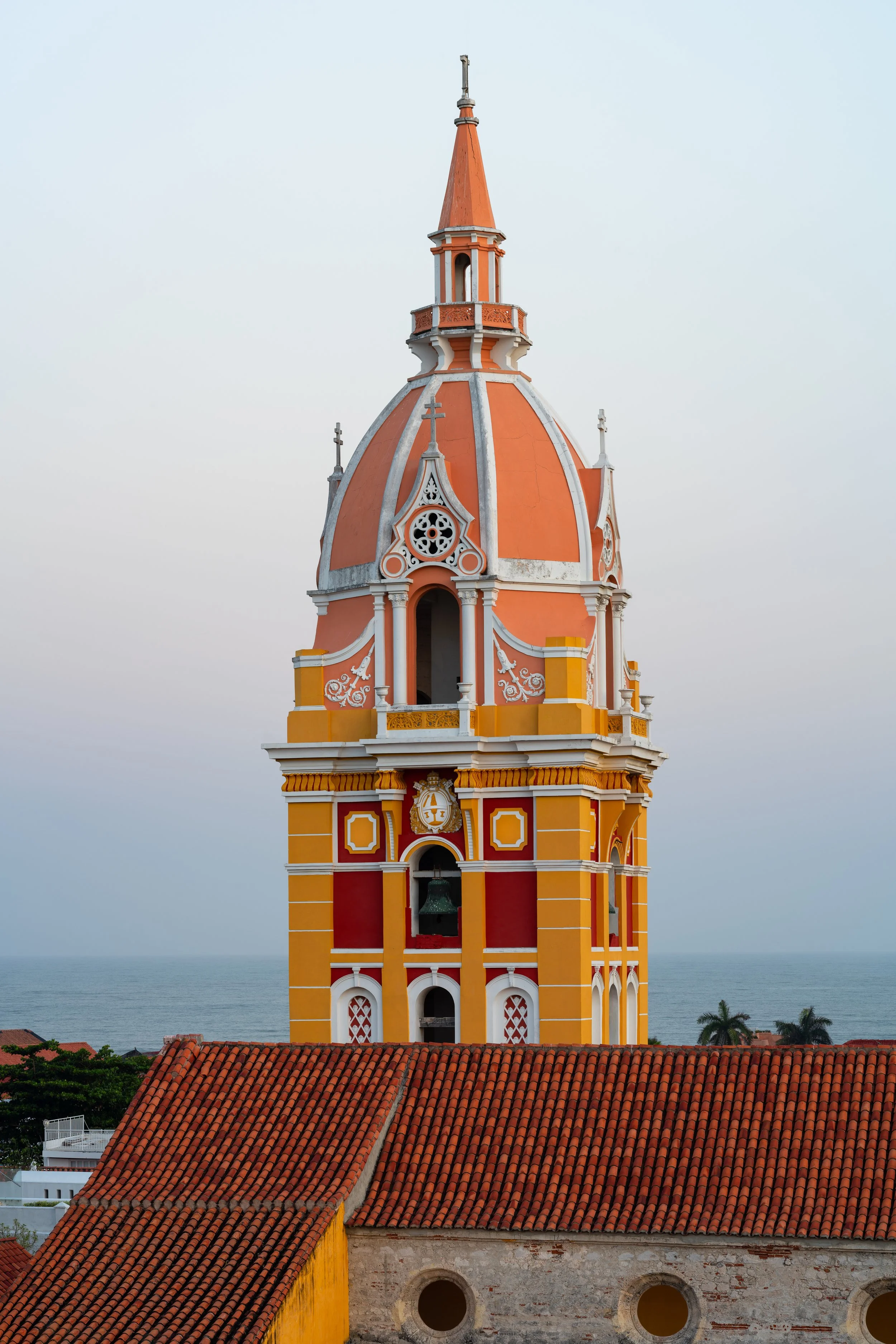
For this post, we will focus on the beautiful bell tower of the Catedral de Santa Catalina de Alejandria. This vividly colored tower is an iconic landmark of the historic quarter of Cartagena and is visible from most locations in the heart of the city. However, the image proved to be a very challenging and time-consuming edit to bring the envisioned final result to fruition.
RAW image straight out of camera
Base Image
This image was taken at 6:32am on February 4, 2023, standing atop the rooftop terrace of the Movich Hotel Cartagena De Indias. The final RAW image is a vertical panoramic consisting of five separate images taken in landscape orientation. My reasoning for taking the image in this fashion was to have a resolution high enough to be able to produce a large print. The lens choice was a 135mm f1.8 prime.
For this particular image, an interesting dilemma existed. Oftentimes while traveling abroad, construction standards and building codes vary. Components of exterior illumination concealed within conduit or vertical columns of a building in one country may not be in another. Another significant element in tropical locations is the presence of organic material along molding and other areas of the façade creating challenging circumstances for producing a clean image.
My ultimate goal was to produce an image that represented how stunning this bell tower truly is. I wanted it to appear as it would have when it was first completed, and the tropical climate had not yet taken its toll on the façade. As enjoyable as it was experiencing this view before the sun rose that day, I knew I would have my work cut out for me in post-production upon returning home.
Areas of Distraction - all elements to be removed and fixed
Distraction Removal & Simplification
As highlighted above, the many distractions to be removed or fixed included missing barrel tiles, HVAC equipment, forty LED spotlights, electrical cables, streetlights, a bird, and the lightning rod atop the dome. As beautiful as this bell tower is, these elements made the composition incredibly cluttered and distracting.
The majority of this work would need to be completed in Adobe Photoshop with the aid of the pen & clone stamp tools. Fortunately, plenty of clean surface areas of similar colors and exposures to sample existed throughout the image affording me the ability to clean up all the messy areas. Making individual selections with the pen tool is always one of the most time-consuming elements of any edit, but the results are typically worthwhile.
Final Edit
Enhancement
Once all distractions were removed, the final phase of this edit included highlighting specific parts of the image by completing local edits. The sky, ocean, cityscape, and stone walls only needed minimal adjustments. The belltower is where the majority of the work would take place.
The vibrancy of the colors was much greater to my eyes than what the RAW image displayed. Three primary color groups would need to be enhanced: reds, yellows, and pinks. As areas of both direct and indirect light existed, two shades of each color would need to be enhanced with both a dark and light variation of each. Simply saturating certain color groups through global edits would not produce the desired effect. I would need to get more granular.
The main process consisted of making selections of various color groups, creating a new selection layer, and then adding a layer mask to each selection layer only making the selection visible. For example - every gold block would be individually traced with the pen tool and then added to a new selection layer. A layer mask would then be applied to the new selection layer so that all edits would only affect that selection. This same process would need to be replicated for each individual color group and area.
Once all selection layers with masks existed, a new color layer with the selection mask was placed above each selection layer. The process of enhancing each color was completed by utilizing the color picker, making small adjustments, and then painting over each selection on the color layer with the brush tool to enhance that specific color with various blend modes and opacities. There were six individual selection layers and color layers for this edit consisting of two shades for each main color group. (Example: Gold - Bright, Gold - Dark, Red - Bright, Red - Dark, Peach - Bright, Peach - Dark)
Upon the completion of all color work, the final stage included minor adjustments to an overall saturation layer and a contrast layer atop the layer stack.
Conclusion
Although this image took an incredible amount of time and effort to edit, the final result is exactly what I had envisioned as I stood upon the rooftop terrace that morning. The extraordinary architecture of that bell tower was showcased in a clean and pleasing manner. The mess of cables, light fixtures, birds, mold, and other various distractions had been removed. The enhancement of the colors replicated how the tower looked to my eyes as I stood there enjoying the view that morning.
Thank you for taking the time to read this article. I hope it was interesting and helpful to better understand my editing workflow. Please leave any questions or comments below and let me know if you’d like more articles detailing the behind-the-scenes aspects of my craft.


